- OptimistiCallie
- Posts
- 📈 The Compound CHART PACK
📈 The Compound CHART PACK
Insane expectations, bonds behaving badly and reincarnation
Callie Cox
September 04, 2025

HAPPY CHART PACK THURSDAY, folks!
Today is volume 2 of 📈 THE CHART PACK 📈, a weekly collection of charts every week tag-teamed by Chart Kid Matt and myself (who work on the same research team IRL!). Like a conversation we have on the desk, but for the whole world to see.
If you like this collaboration (or have constructive feedback), shoot me an email at [email protected]. And if you want more where this came from, subscribe to Matt’s newsletter here.
Smash the button below to share OptimistiCallie (and THE CHART PACK) with a friend 😊
Chart #1: Nvidia’s expected to crush it through 2030
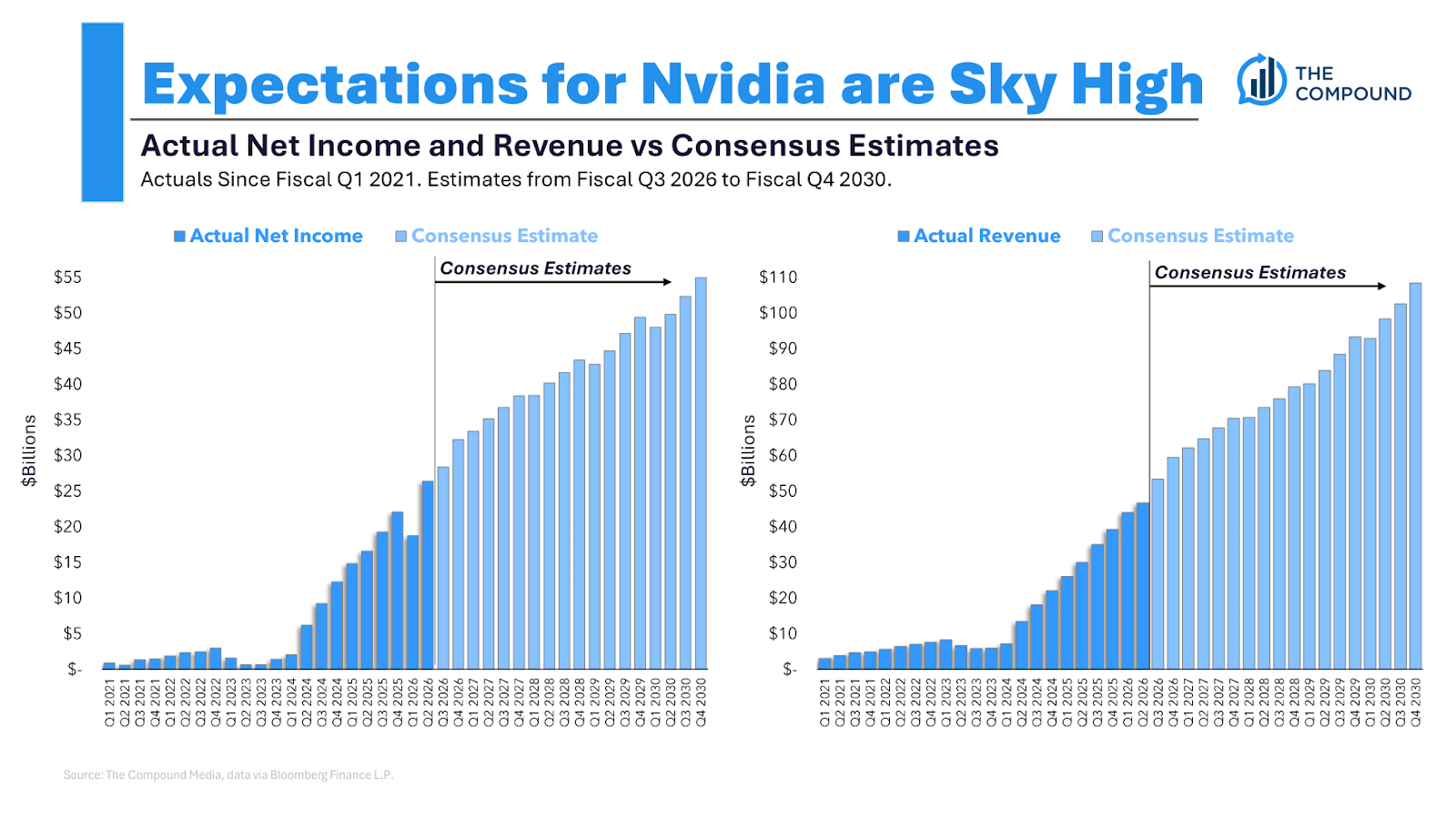
Chart Kid Matt: When I pulled up the net income and revenue estimates for Nvidia through the end of fiscal 2030, I almost couldn’t believe the numbers. Analysts expect $55 billion of net income on $110 billion of revenue by the end of this decade for the company. To put it bluntly: the expectations for Nvidia are insane.
OptimistiCallie: 27% annual growth rate in revenue over the next five years? C’mon that’s child’s play.
For real, that’s impressive if Nvidia can maintain its AI-generated momentum. 2030 is a long ways away, though (although no doubt I will be talking about how time is flying five years from now). That’s a lot of time for AI winners and losers to shake out. Nvidia may be the preferred chipmaker in this moment, but it’d probably need to hold that status for a while to put these types of growth rates up. I remember when people thought BlackBerry would crush Apple.
Chart #2: Concentrate!
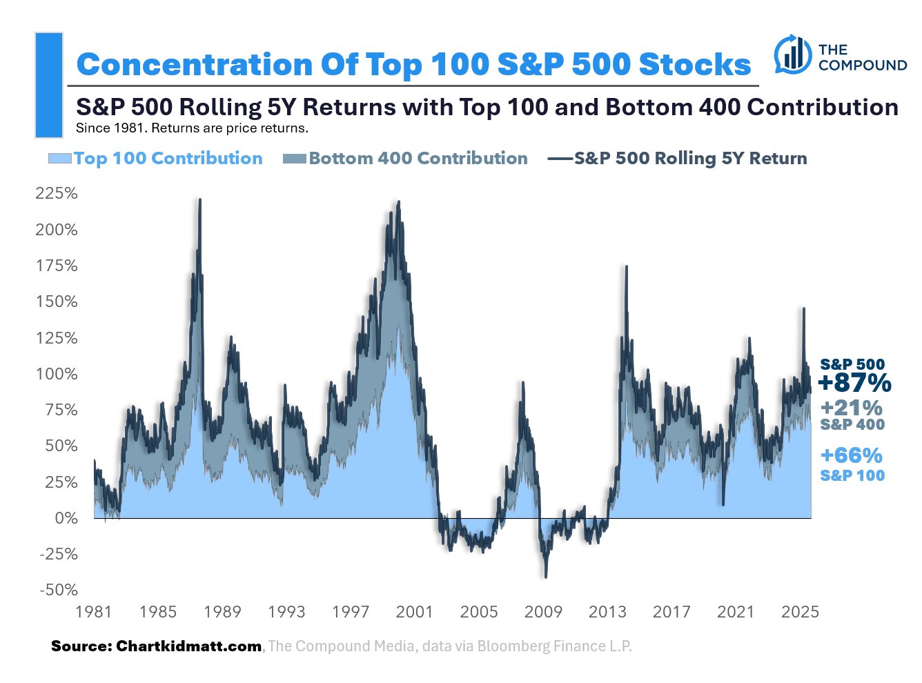
Chart Kid Matt: There’s been a lot of talk about market concentration in recent months, so I wanted to dig into the numbers myself to truly understand what is happening. I decided to plot the rolling 5-year returns of the S&P 500 broken out by the top 100 and bottom 400 companies. Over the past five years, the S&P 500 has returned 87%. 66% (about ¾) of that 87% overall S&P 500 return has come from the largest 100 companies. The remaining 21% has come from the bottom 400. So yes, markets are concentrated. But historically, concentration is normal. Notice how the light blue shade makes up roughly ½ of the returns over all rolling 5-year periods since 1981? That’s the top 100 companies pulling the weight for the index.
OptimistiCallie: I like the reminder here that concentration isn’t anything new. Certain companies and industries gobble up market share over different periods of focus and innovation. You can’t call it a b-word just because the stocks you don’t own are doing well.
On the practical front, concentrated markets are a good reminder to constantly check targets your own investments. Fewer stocks are driving market returns, and while that may not spell imminent danger for the entire market, it may be warping your portfolio into a tech-heavy pile of investments that don’t suit you or your goals.
Chart #3: Stocks trade on earnings…sort of.
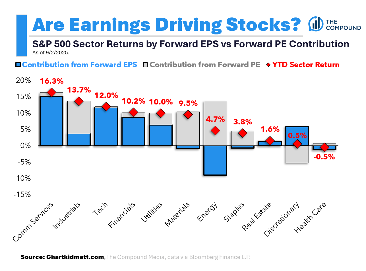
Chart Kid Matt: The chart above breaks down year-to-date sector (price) returns by forward earnings per share and forward price-earnings contribution. The blue part of each bar shows the contribution from forward EPS while the gray parts show the contribution from forward PE (multiple expansion/contraction). Red diamonds indicate the actual YTD sector return. The bars that stood out to me were communication services and tech. Nearly all of the returns for both of these sectors have come from growth in Forward EPS and not multiple expansion.
OptimistiCallie: This is the argument for buying tech. Yes, expectations are high, but tech is also the profitability golden child of America. It can meet that high bar. On the other hand, profit estimates for industrials and materials have been walloped by tariff fears that haven’t quite made it into stock prices.
To be clear, though, the bar is exceedingly high for tech companies (see Nvidia up above). S&P 500 tech companies made up about 23% of total first-quarter index profits in the first quarter, yet their shares accounted for about 33% of the S&P 500's value at the end of Q2. To close that gap, tech profits would have to grow 40%, or tech stocks would have to drop 29% from their end-of-June levels.
Earnings are a sector-by-sector story. Matt clearly agrees with me. Change our minds.
Chart #4: Bonds behaving badly
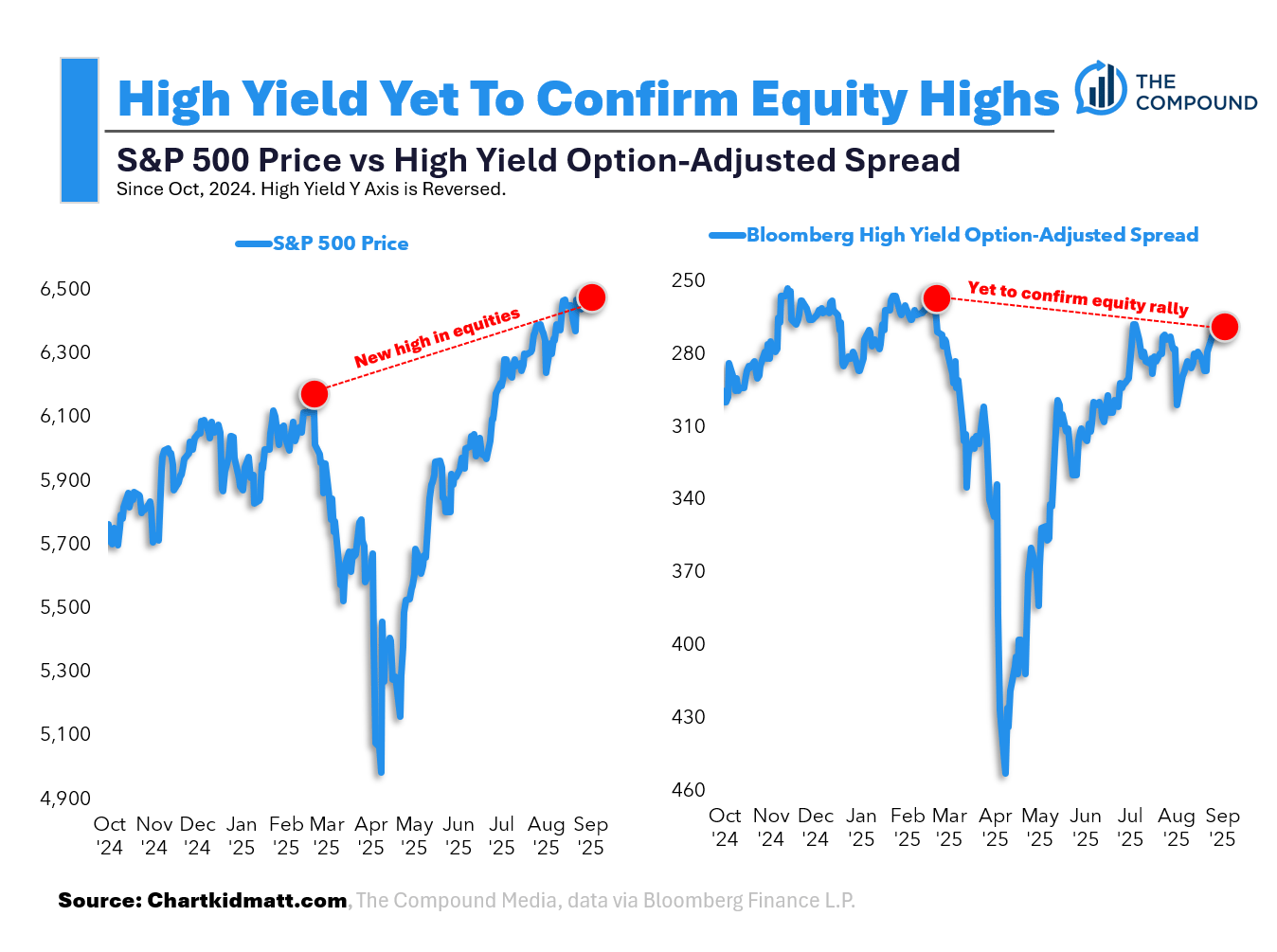
Chart Kid Matt: “If there was reincarnation… I want to come back as the Bond Market.” - James Carville.
I’m paraphrasing Carville, but that quote has stuck with me ever since I first read it. The bond market has long had a reputation as the “smartest” market, often viewed as a leading indicator of economic trends and risk sentiment. While equities have made new highs, high yield spreads have yet to confirm the rally. It’s not a glaring red flag, as divergences have eventually resolved themselves in the past, but it is something I am monitoring.
OptimistiCallie: The bond market is where you see stress show up early (I’ve written about this before). Capitalism runs on risk and leverage, after all.
High yield spreads — or the difference between high yield interest rates and Treasury interest rates of similar maturities — typically jump when times are tough and fall when conditions are calm. They tend to bottom way before stock market drops, though. We’re talking three years before the dot-com bubble burst and seven months before the global financial crisis rattled the stock market. What you want to watch here is if spreads jump suddenly. Then, you’re in trouble.
For the record, if reincarnation were a thing, I’d want to come back as the VIX. Spiky, unpredictable, and always getting way too much attention.
Huge thanks to Chart Kid Matt (aka Matt Cerminaro) for the charts and thoughts this week. Subscribe to his newsletter, and check out Exhibit A, the Compound’s visual storytelling platform that you need for your clients.
Thanks for reading!
Callie
Like what you just read? Share it with a friend, pretty please 😊